Take a look at this quick video on projections:
This web page allows you to drag countries around to see how they are distored in GoogleMaps: True Size.
The images below are from the "Projection Explorer" tool in BlueSpray which we will use in a lab in the near future. This tool shows the relative amount of distortion caused by each projection. Areas with a lot of distortion are color-coded in red while those with little are color-coded in green.
Alber's is a conic projection that is used to represent regions in the mid-latitudes, including the United States of America. Notice that regions below the equator are highly distorted with the south pole being stretched into a huge circle around the outside of the map. The north pole is also distorted and is made into a circle even though it is really a point. This shows that while Alber's maintains area, it does so at the cost of distance distortion.
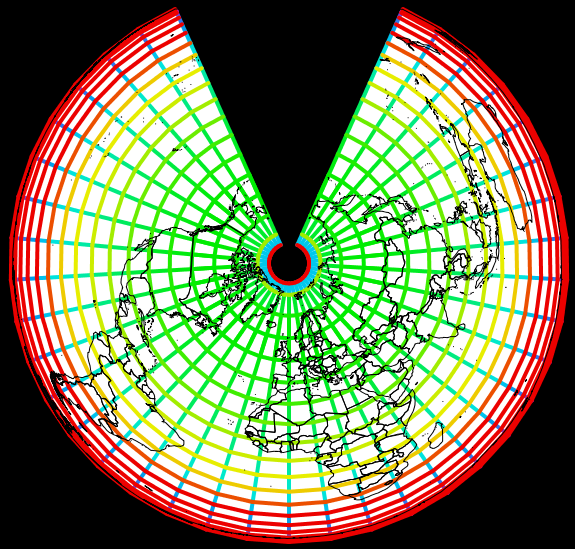
Distortion Along Lines of Latitude and Longitude (Distance Distortion)
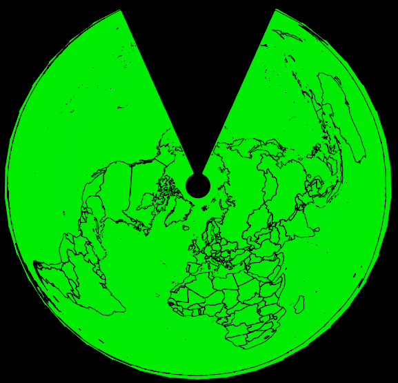
The image above shows that Alber's is very good at maintaining areas over large regions, almost the entire world.
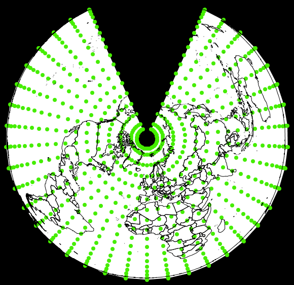
Alber's also maintains the angles (Conformal Distortion)
The images below show that the popular Mercator projection distorts are and distance everywhere but near the equator.
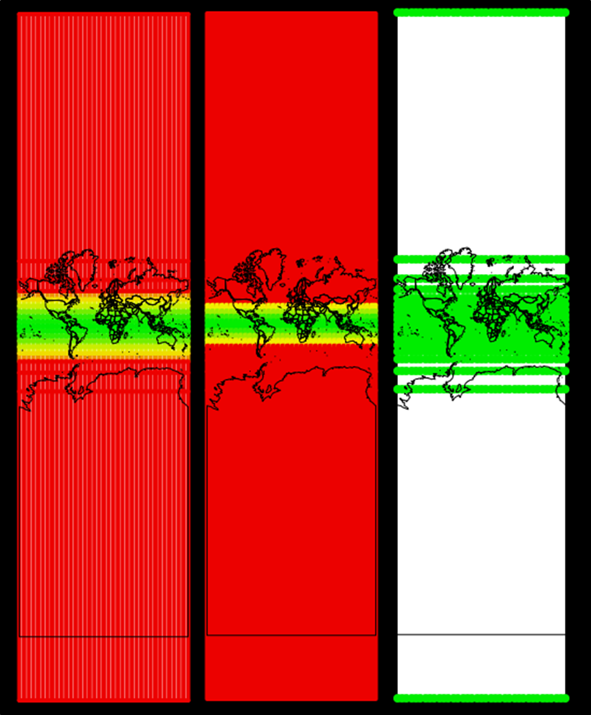
Distortion along the parallels and meridians (left), in area (center), and in form (right).
Mercator preserves the form (shape) of areas but greatly exaggerates distance and area. Note the size of Greenland and Africa below.
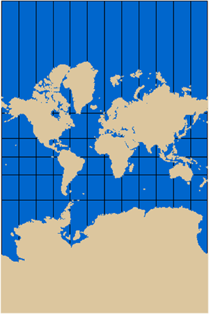
In reality:
Like all projections, Mercator takes the spherical coordinate values (latitude and longitude) and "projects" them onto a flat surface. The image below shows how it does this.
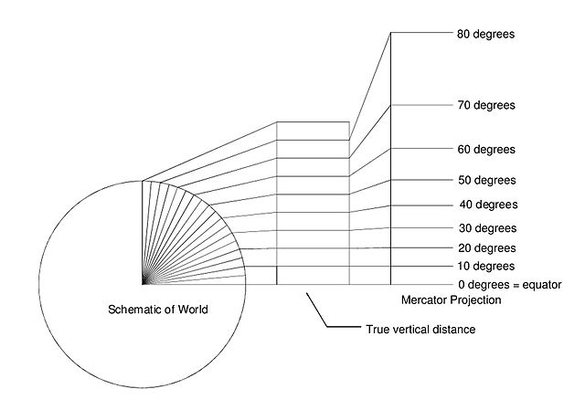
Image courtesy of A B van Brakel, Wikimedia commons.
© Copyright 2018 HSU - All rights reserved.